Post Internet and digital devices era, the font type, font size and background color have assumed new importance.
For the last 20 years, self-publishing has been spreading fast and wide, because this process gives many opportunities to emerging writers to get published on time and get recognition. Particularly self-publishing platforms like Amazon’s Amazon’s Kindle Direct Publishing or KDP, Lulu, IngramSpark, Smashwords, Barnes & Noble Press, Mac’s Apple Books and others have changed the publishing profession for ever. There has been a surge in the number of published authors worldwide. And that is for good. Several authors have gone to win awards and recognition and many others have become celebrities in shorter time span.
- Ads
- Book Marketing Master Plan
- Fiction Plots Monthly – Affiliate Information
- “Book A Day System” Monthly Plan
- KDSPY v5 Software

However, many authors are making great mistakes by not paying attention to readability factors that influence the readers. In the age of the Internet and spread of usage of digital devices, the number of readers who used to read books in paperback format has drastically decreased worldwide. Young people prefer to read books on digital devices than in paperback format. Given such facts, the font type, font size and background color of your book have assumed new importance.
Authors must use font types, font size, and page background color more carefully to prepare the book retina ready. A book with larger font size on white background stands out cool in the eyes of the readers and hence would increase readability.
- Ads
- Book Marketing Master Plan
- Fiction Plots Monthly – Affiliate Information
- “Book A Day System” Monthly Plan
- KDSPY v5 Software
Font Types
1. Use serif typefaces for body text. Serif typefaces are the fonts that have end strokes or leads. Most common typefaces are: Times New Roman, Bookman Old Style, Cambria, Georgia.

2. Use sans serif typefaces for all large titles such as headings, topics and sections. Sans serif typefaces are the fonts that don’t have end strokes or leads. Most common typefaces are: Arial, Calibri, Tahoma, Open Sans, Verdana.

Font Size
I would recommend a little larger font size even for body text. For example, it is better to use Times New Roman in 14 size than in 12. It will improve readability. Small font sizes strain eyes and can lower readability.
Background Color
Traditionally, the book publishers have used cream papers. Smaller font size on cream color pages lowers readability. It is advisable to use white paper instead for both digital and print editions. Even if you use a smaller font size on white papers, the body text will look fine. But use a larger font size any way on a white page.
- Ads
- Book Marketing Master Plan
- Fiction Plots Monthly – Affiliate Information
- “Book A Day System” Monthly Plan
- KDSPY v5 Software
White background for both digital and paperback editions of a book increases readability. Young and senior citizens would love the black font types on white screen.
About the Author
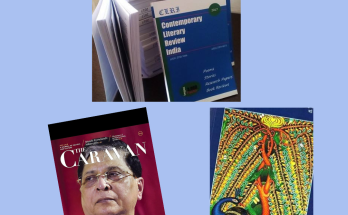
Khurshid Alam is a writer, editor, publisher and technocrat. He is a founder-editor of a leading literary journal in English titled as as Contemporary Literary Review India.